facebook twitter pinterest instagram
  • Home
  • About
  • DIY
    • Diy home decor
    • diy events
      • Birthdays
      • baby bridal shower
      • weddings
    • Diy holidays
      • Christmas
      • Halloween
      • new years
      • Thanksgiving
      • Valentine Day
    • Diy Kids
  • Home Decor
    • before And after
    • Diy home decor
    • Decor tips
    • High-low
    • home tour
    • Trends
    • One room challenge
  • By Rooms
    • Bathroom
    • Dining room
    • outdoor
    • Kids room
    • kitchen
    • laundry
    • living room
    • Office
    • Bedroom
  • Life
    • Entertaining
    • Family
    • Fashion
    • recipe
    • travel
    • Gift Guide
    • Spotlight
  • Shop
    • weekly faves
    • Reviews
    • Free printable
  • Design Studio

Harlow & Thistle

If the kitchen is the heart of the home, the island is the aorta.  The kitchen island has acted as a space divider in our open concept homes and has created a hub for entertaining. While the island has solved for many needs it has also introduced some new challenges. For example, eating dinner beside each other rather than across from each other has hindered our ability to connect plus the height of the counter stool makes long term sitting uncomfortable. So today we're sharing a new trend in kitchen interiors, kitchen tables replacing kitchen islands. The aorta isn't leaving it's just evolving. Here are some of our favourite examples of this trend alert:

Trend Alert: Kitchen Table Replacing the Kitchen Island
Source: am Designs

Trend Alert Kitchen Tables Instead of Kitchen Islands-
Source: Artichoke Ltd

Trend Alert: Kitchen Table Replacing the Kitchen Island

Trend Alert: Kitchen Tables Replacing Kitchen Islands
The Shaker Kitchen Co

Trend Alert: Kitchen Tables Replacing Kitchen Islands
Source: Leanne Ford Interiors

Trend Alert: Kitchen Tables Replacing Kitchen Islands
Source: La Journo De Maison 

Trend Alert: Kitchen Tables Replacing Kitchen Islands
Source: Leanne Ford Interiors

Trend Alert: Kitchen Tables Replacing Kitchen Islands
Source: Pepe Paris

Shop this post:
23:41:00 No comments

Do you love a good before and after? Well hold onto your caps (or is it hats? err butts? not sure of the idiom but you get the idea). Today we're revealing the Carriage Hill Project! The homeowners are a lovely newlywed couple who reached out to us in August to renovate their first home. The house, in it's original state, was oozing with potential and had so many great features; nice layout, beautiful moldings, heated floors, gorgeous backyard etc (good bones as they say in the biz). We were tasked to update the whole house and give it a more contemporary feel. We are super pleased with the way this one turned out and we can't wait to share the results with you so without further adieu here is the Carriage Hill Project Reveal.

Carriage Hill Project Reveal

16:08:00 No comments
I have a very small pantry in my new home so it is essential that we use the space efficiently. Recently this little pantry was busting at it's seams so I decided to give it a mini makeover and post my tips for organizing your pantry here (well below). Special thanks to our Modern Handmade home series partner Kitchen Stuff Plus for all the organizational storage required to make this pantry makeover possible.


Tips for Organizing your Pantry

Here is a photo of what this tiny pantry looked like before:

Tips for Organizing your Pantry

... And here is the after:

Tips for Organizing your Pantry

Tips for Organizing your Pantry:

Remove Everything and Clean
To start remove everything from your pantry (even if you know you're going to keep it). Throw out or donate unwanted food, consolidate snacks and only keep the essentials. Clean the shelves thoroughly and perhaps think about painting or wallpapering the inside of the panty.

Tips for Organizing your Pantry

Take Measurements and Plan
Measure the depth, length and height of your shelves. Visit the Kitchen Stuff Plus website and determine which container sizes correspond with your needs. Do you need containers for pasta? spices? Baking confections? Cereal? Other food? Keep in mind not everything will require a new container.

Tips for Organizing your Pantry

Purchase and Layout Containers
Once you've confirmed your plan it's time to put it into action.  Purchase your containers. Give them a rinse. Place them in your empty pantry as a trial run. Test out different locations. Step back and take a look. Once you've confirmed their placement you can fill them and start setting up your pantry.

Tips for Organizing your Pantry

Finalize your Pantry and Enjoy
Place the rest of your food back into the pantry. Again adjusting as you go to ensure optimal space is used and it is pleasing to the eye. Enjoy your pantry and have fun cooking!

Tips for Organizing your Pantry

Tips for Organizing your Pantry


I'm really happy with the way this turned out. It reminds me of a tiny store in my kitchen. Be sure to check out the other bloggers in the Modern Handmade Home Series Thalita from The Learner Observer, Lindi from Love Create Celebrate and Colleen from Lemon Thistle.  

pantry organization


This post is in partnership with Kitchen Stuff Plus. All expressed opinions are my own.
 
01:44:00 No comments
When renovating a kitchen or bathroom a faucet decision can carry a lot of weight. It's a bigger  decision than paint or accessories because it's more permanent and needs to last the test of time. You'll want your faucet to be classic so it has longevity but also something that works with the style of your whole home. Here are my Tips for Choosing a Faucet:

Tips for choosing a faucet

1. Style - Your home probably already has a certain style or a style that you are trying to achieve so you'll likely want to continue this into your kitchen and bathroom fixtures. Delta faucets has something for every style; whether you're a traditionalist who appreciates craftsmanship and heritage details or someone with a transitional style that leans towards cleaner lines and classic looks or perhaps your style is contemporary with more simplistic modern lines, there is something for everyone. If you're not 100% of your style take the Delta Style quiz to help make it a bit clearer.

2. Finish - Today there are so many finishes available. There are silver undertone finishes like polished nickel, brushed nickel or chrome that tend to act as a neutral and are the most common. Then there are the warmer tones like champagne bronze or copper that can highlight a unique fixture. Becoming increasingly more popular are bold solids like black or white that can add a modern classic touch. How do you choose? First decide whether you would like a statement piece to act as a focal point in the space or if you would prefer for your fixtures to match the other hardware in the space like the towel bar or cabinet pulls. This tends to be the most common and safest bet. For our kitchen reno we selected the Delta Cassidy two handle faucet in a champagne bronze to match our cabinet hardware and sconces, I love the way it pairs so nicely with our navy cabinets as well.

3.  Technical Specs - These considerations are not as much fun as the previous two but are no less important. When choosing your faucets for your kitchen or bathroom be sure to confirm how many holes are in the sink and select a faucet accordingly. Check the spout height, ensure it will work in your space, that it is comfortable and doesn't bump into anything. Single verses multi-handle is another consideration, single is easier to clean but the symmetry of multi-handle is also nice. Finally for a kitchen faucet decide if you would like a pulled down sprayer or conventional handle sprayer. 

Tips for choosing a faucet
I feel that faucets and hardware are the jewellery of the kitchen and bathroom so it's important to get them just right. I hope these tips have been helpful. Stay tuned for my full kitchen reveal coming soon.

This post is in partnership with Delta Faucet Canada. All expressed opinions are my own. 
 
23:15:00 No comments
Do you love kitchen cabinet hardware as much as I do? I feel like it's the jewellery of the kitchen. Once we installed our hardware on our new kitchen it really pulled the whole look together. As part of the Modern Handmade Home Series we've partnered with Schaub and Company to share a post using their beautiful cabinet hardware. We selected their Heathrow Collection in Satin Brass for our new kitchen cabinets and I cannot tell you how much I love them (especially against my navy blue cabinets). Of course we faced the age old question of where to put knobs vs pulls and I realized I have a few opinions on this so I thought I'd share them with you below.

knobs or pulls on kitchen cabinets

Traditionally knobs are used for cabinet doors and pulls are used on cabinet drawers however these days anything goes. You will often see people using knobs for drawers for consistency or based on the size of the drawers. Of course we often see pulls being used on cabinet doors as well so it really is a personal preference.

knobs or pulls on kitchen cabinets

My personal preference is long horizontal pulls running the length of the base cabinets (whether they're drawers or doors).  I have been known to install pulls horizontal on base cabinet doors just to maintain that line. In my new kitchen we went the traditional route with knobs on the doors and pulls on the drawers and I think it looks great.

knobs or pulls on kitchen cabinets

There are pros and cons to each option: Knobs tend to be cheaper and easier to install but they can often get caught on things like clothing etc.  Pulls can have a big impact but are often more challenging to install and can be a bit awkward as a door pull.

knobs or pulls on kitchen cabinets

knobs or pulls on kitchen cabinets

Here's a little video to see this Schaub and Company cabinet hardware in action.


Be sure to check out the other bloggers in the #modernhandmadehome series to see their projects with Schaub & Company cabinet hardware: Lindi from Love, Create, Celebrate, Colleen from Lemon Thistle and Thalita from The Learner Observer.


This post is in partnership with Schaub and Company. All expressed opinions are my own. 
09:21:00 2 comments
There are a few things I love about adding wall art to a space, number one I love how it adds instant colour without painting the wall. I also love that it can convey a feeling and tone for the room. Lastly, probably my favourite thing, I love that I have the option to change out the print down the road (hello mini makeover).  The art in the photo below is a piece called "circles on canvas" from Décors Véronneau a Canadian retailer of various wall art and artificial plants.  I like this piece because it has curves, which adds a sense of calm and happiness to a space plus the colour repeats from my kitchen adding to the harmony in my home overall. These are just a few consideration I make when selecting wall art and below you will find a few more of my tips on how to choose the perfect wall art for your space.

How-choose-perfect-wall-art-space

The first thing I would suggested when selecting the perfect wall art for a space is to trust your gut.  If you like something, you will always like it. Chances are you will be looking at this art work for a long time so make sure it's something that you like and that "sparks joy” (yes I’m jumping on the band wagon).

How-choose-perfect-wall-art-space

How-choose-perfect-wall-art-space

The next suggestion I have for choosing the perfect wall art is to look around your space and try to pull inspiration from the hints of colour existing in your space. For example, I decided on blue because my kitchen just off this space has navy blue cabinets and I loved the repetition. Décors Véronneau has a wide selection of wall art to choose from so you’ll be sure to find something to suit your needs. They have everything from palm leaves, to geometric abstracts, to chevron prints. Plus many of them have free delivery!

How-choose-perfect-wall-art-space

How-choose-perfect-wall-art-space

Also, if you're thinking about adding new accessories to your space keep your wall art in mind. For example, I decided to add these mint green cascading succulents to my space which pull directly from the print (and are also available at Décors Véronneau). I tried the arrangement on the table but I preferred it on the shelf in the end.

How-choose-perfect-wall-art-space

Lastly, measure your space and consider taping the dimensions of your desired print on the wall prior to purchasing. This will help you visualize it and may even convince you to select something larger. As a note, art work should be hung no more that 15 cm above your furniture.

How-choose-perfect-wall-art-space
 
This post is in partnership with Décors Véronneau. All expressed opinions are my own.
09:29:00 No comments
Our kitchen reveal is almost ready but to be honest I'm still contemplating whether or not to paint this wall a dramatic blue (like the cabinets). In the meantime, I'm super excited to share a sneak peak of the gorgeous lighting we've installed. As part of the Modern Handmade Home series we've partnered with Mitzi Lighting to share some fun lighting transformations and my top 5 wall sconces for the kitchen. The sconces in my kitchen are Winnie from Mitzi Lighting. I love the lighting at Mitzi, it's modern with a traditional twist and they're always updating their selection. When I decided to opt out of upper cabinets in my kitchen I knew I needed some fun lighting to add interest and make the space pop. These lights have really hit that mark. I feel like they give my kitchen an old world bistro feel, if that's a thing lol. Scroll below for my Top 5 Wall Sconces for the Kitchen.

Top 5 Wall Sconces for the Kitchen

Top 5 Wall Sconces for the Kitchen

Top 5 Wall Sconces for the Kitchen

Top 5 Wall Sconces for the Kitchen

Top 5 Wall Sconces for the Kitchen:
1. Julia from Mitzi Lighting
2. Winnie from Mitzi Lighting
3. Alyssa from Mitzi Lighting
4. Everley from Corbett Lighting
5. Garden City from Hudson Valley Lighting

Be sure to check out the other bloggers in the #modernhandmadehome series to see how they've changed their spaces with Mitzi Lighting: Thalita from The Learner Observer, Lindi from Love, Create, Celebrate and Colleen from Lemon Thistle.


This post is in partnership with Mitzi Lighting. All expressed opinions are my own.
10:10:00 No comments
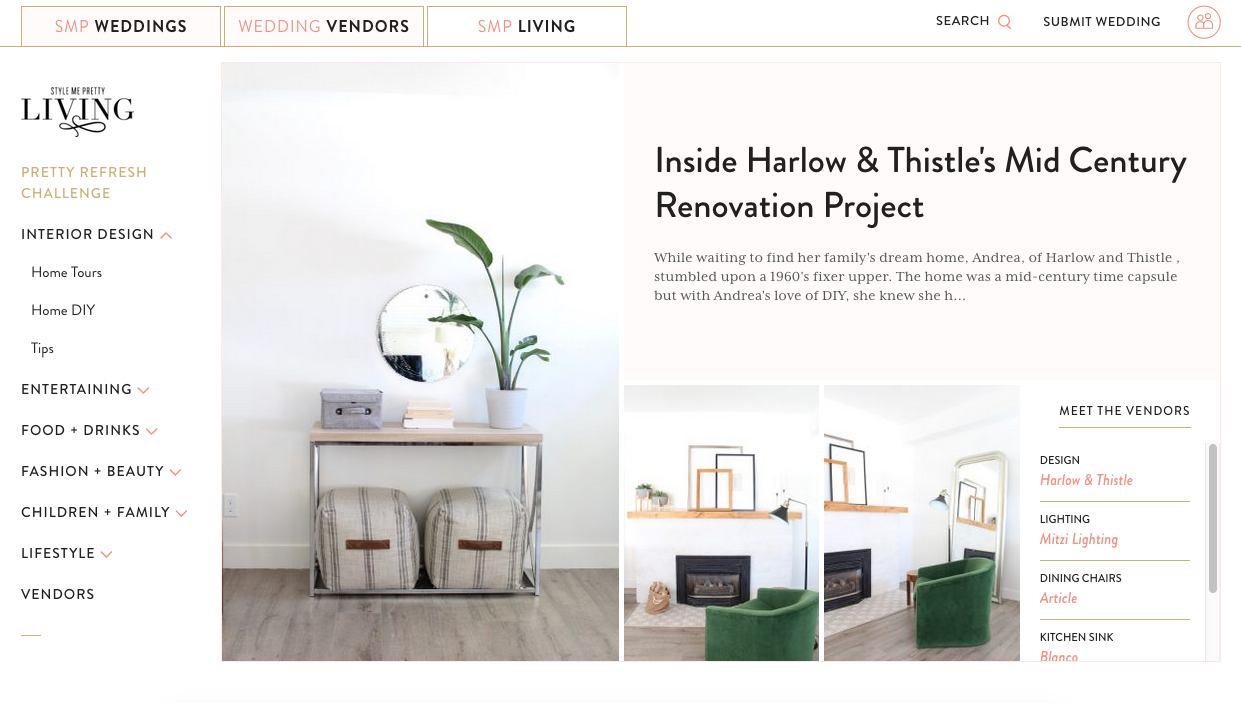
I have some big news! Style Me Pretty Living featured my little 1960's fixer upper in their SMP Living Home Tours. Honestly I was honoured to be recognized by such a prestigious online magazine. The SMP Living team did such a lovely job piecing together the story of our renovation project and they really made it look beautiful. I suspect I'll be reeling from this high for awhile, doing random shreeks of joy. Part of my SMP Living Home Tour included my DIY Wall Mounted Pot Rack and it made me realize I hadn't posted the tutorial to the blog yet so I thought I'd post it today.

DIY-wall-mounted-pot-rack-1

I really feel pot racks are making a come back. They're functional and they turn your everyday pots and pans into works of art. The blank wall behind the island in my kitchen needed a functional focal. Since my kitchen lends itself to that "old world" charm I thought a DIY wall mounted pot rack would be the perfect element to fill that wall.

DIY-wall-mounted-pot-rack-2

DIY-wall-mounted-pot-rack-3

All that I used to create this beauty was a few strips of wood (or dowel), black paint and some shower curtain hooks (yep you heard right). I literally laid out what I wanted to do on the floor of the hardware store so I knew exactly what I needed and could select wood that wasn't warped. I brought everything home and painted the wood black. I first installed the two vertical pieces to the wall with screws and then used my nail gun to adhere the horizontal pieces. I eye-balled the spacing because I knew I wanted a larger space at the bottom. Then I added the shower hooks and hung the pots off of them. Note, you may need an additional nail or screw in the middle of your horizontal pieces depending on their length. Other than that it's an easy way to include a trendy functional piece into your home at a lower cost (unless you're a blacksmith or someone who knows a blacksmith, in that case I say go cast iron).

DIY-wall-mounted-pot-rack-5

DIY-wall-mounted-pot-rack-7

DIY-wall-mounted-pot-rack-8

That's it! Be sure to check out more pics on the SMP Living Home Tour and excuse me while I go celebrate - Shreeek!

smp-living-harlow-and-thistle
10:23:00 No comments
We made it! It’s the final reveal of the One Room Challenge (ORC) Fall 2018 sponsored by Better Homes & Gardens! Today I’m unveiling my mid century modern farmhouse kitchen makeover! I’m so happy with the way it turned out. It’s a true mix of mid-century and modern farmhouse. It has all the elements of mid-century (in keeping with the history of our house) but with enough modern elements to keep it relevant for today.  Let me know what you think in the comments below!

ORC-mid-century-modern-farmhouse-kitchen-makeover

ORC-reveal-mid-century-modern-farmhouse-kitchen-makeover

ORC-reveal-mid-century-modern-farmhouse-kitchen-makeover

ORC-mid-century-modern-farmhouse-kitchen-makeover

ORC-mid-century-modern-farmhouse-kitchen-makeover

If you're new here, let me give you some background, we bought this cute mid century bungalow as a small flip project and have made so many changes to it that we are beginning to fall in love. When we first opened the door it was a like a time capsule from the 1960's. You can get a better idea of what I'm talking about in the Week 1 before photos. Our aim is to sell this puppy back to a first time home buyer at a reasonable price so we've tried to keep our costs as low as a possible during this kitchen makeover. You will see our appliances are not top of the line but they fit our budget and still look good. We tried to DIY wherever possible like with the range hood, yes, that's a DIY range hood for under $250 (read more about it in Week 3). Oh yes and you can catch up on any of the previous weeks below:

Week 1 (The Before!)
Week 2 (Ikea Kitchen)  
Week 3 (DIY Range Hood Cover)
  Week 4 (Backsplash Tile) 
Week 5 (Wallpaper)

Here is a quick pic of what the kitchen looked like a few weeks ago:


In the beginning we had planned to knock down the wall between the kitchen and dining room but for numerous reasons we weren't able to so we instead decided to expand the door way. This was a good solution because it does feel more open concept but there's enough wall to hide the dishes in the kitchen haha.

ORC-mid-century-modern-farmhouse-dining-room-makeover

ORC-mid-century-modern-farmhouse-kitchen-makeover

For our sink we selected the Blanco VISION 210 double SILGRANIT sink because of it's durability and looks. SILGRANIT is a natural granite composite material that is strong, durable and comes in seven colours.  This sink is part of the VISION series that has a variety of bowl configurations, options and accessories plus it's made in Canada so that's a plus for me.

ORC-mid-century-modern-farmhouse-kitchen-makeover

We also installed the Blanco SOLENTA Senso faucet. This faucet has touchless technology allowing you to activate the on and off switch without touching the handle. It's a really unique and practical feature (especially when you're cooking with poultry).

ORC-mid-century-modern-farmhouse-kitchen-makeover

Our cabinet hardware is from Schaub and Company, they have a ton of selection of really unique yet timeless hardware. We selected Regatta pulls in a Satin Nickel finish. I love how delicate yet substantial they are and I love how they create a perfect horizontal line across each door. We hung them all horizontal (even on the uppers) to give it a modern and clean feel.

ORC-mid-century-modern-farmhouse-kitchen-makeover

If you've been following me on Instagram you know I was searching for some affordable copper pots because I really want the kitchen to have a mix of metals. I never found them so I couldn't make my pot rack as I had hoped but my mother-in-law lent me an amazing antique copper urn and I think it adds the perfect amount of copper.

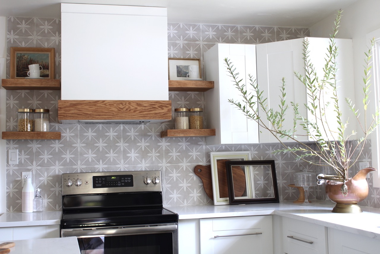
Our Laura Ashley ceramic tile backsplash in Wicker Dove Grey. We picked up this tile from Eden Tile-it and I love it. It adds a bit of interest without being over bearing. In an ideal world I would have done open shelves all the way across but I wanted to give the next home-owners some uppers with privacy (these are the only ones in the room). 

ORC-mid-century-modern-farmhouse-kitchen-makeover

Our lighting is one of my favourite things. It has a mid century vibe with a modern twist. Both the pendants and dining room chandelier are from Hudson Valley Lighting from the Mitzi Collection (specifically ASIME) and I'm thrilled with the way they look. I was a bit worried my space was turning out too farmhouse but the lighting pulls it right back. They give off amazing light and they look great from the outside looking in (a feature I wasn't really thinking about but totally elevates the exterior of the house as well).

ORC-reveal-mid-century-modern-farmhouse-kitchen-makeover

ORC-reveal-mid-century-modern-farmhouse-kitchen-makeover

ORC-mid-century-modern-farmhouse-kitchen-makeover

ORC-reveal-mid-century-modern-farmhouse-kitchen-makeover

ORC-mid-century-modern-farmhouse-kitchen-makeover

These incredible counter stools are from Hayneedle. They are metal which is great for my two little kids because they can make a mess and I can wipe it right off. Plus they are super stylish and add another modern touch to the space while anchoring the island. They really balance the black framed window and dining chairs. The mirror is a thrift store find but I found another bamboo style mirror for you.

ORC-mid-century-modern-farmhouse-kitchen-makeover

ORC-mid-century-modern-farmhouse-kitchen-makeover

The wallpaper in the dining room is from Spoonflower, the largest indie design marketplace in the world, where you can create your own design or choose from over 650,000 designs online. I selected Parrots, Tulips & Ferns by Andrea Alice (I might be partial to the name). I love the subtle design and I love the hint of throw-back to the mid-century era.

ORC-mid-century-modern-farmhouse-kitchen-makeover

The chairs and ottoman in the dining room are from Article a Canadian company full of mid century inspired furniture. I am in love with this store. I love the skinny legs of the chairs and how comfortable they are. They really add a juxtaposition to the antique duncan phyfe table.

ORC-mid-century-modern-farmhouse-kitchen-makeover

Special thanks to my sponsors; Schaub and Company, Article, Hayneedle, Hudson Valley Lighting and Blanco Canada. I'd also like to thank Better Homes & Gardens for being the media partner for this event.

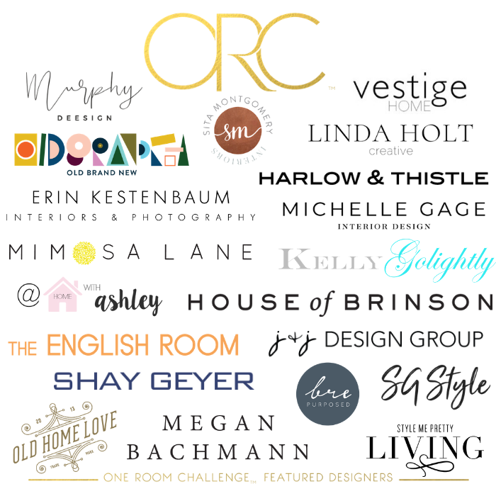
Be sure to check out the reveals of the other featured designers in the One Room Challenge (see links below). As always a special thank you to Linda of Calling It Home for creating this event and asking me to be one of the twenty featured designers of the One Room Challenge Fall 2018 edition. It is an honor to be included with this talented group. Check them out below:


At Home with Ashley | Brepurposed | Dabito | The English Room
Erin Kestenbaum | Harlow & Thistle | House of Brinson | J & J Design
Kelly Golightly | Linda Holt | Megan Bachmann | Michelle Gage
 Mimosa Lane | Murphy Deesign | Vestige Home
Old Home Love | SG Style | Shay Geyer | Sita Montgomery | SMP Living
Media Partner Better Homes & Gardens | TM by ORC

07:00:00 14 comments
Older Posts

Hello!


Hi! I'm Andrea, I'm a Designer, a momma and a hopeless DIY'er. My passion to achieve luxe for less led me to create Harlow & Thistle, a place to get home design inspiration and modern DIY home decorating ideas.

Email me to collaborate: harlowandthistle@gmail.com

SUBSCRIBE NEWSLETTER

Featured On

https://www.stylemepretty.com/living/2019/03/11/inside-harlow-thistles-mid-century-renovation-project/
 
https://houseandhome.com/video/blogger-harlow-thistle-budget-friendly-suburban-home/

https://www.styleathome.com/decorating/trends/article/the-hottest-design-trends-for-2017

Follow

Featured post

Modern Living Room Makeover

Popular Posts

  • DIY Gold Cake Stand
  • DIY Burlap Christmas Tree
  • DIY Holiday Ornament / Party Favour

Recent Posts

Created with by ThemeXpose