If you're too old for celebrating Halloween or dressing up (let's be honest you're never too old to dress up), you can always have a minimalist Halloween dinner party. Today I'm sharing our Halloween table scape which is as much interior design as it is Halloween decor. I'm a big fan of modern minimalist design in general and when it comes Halloween design I like to keep it that way. Let's be honest I'm not into the gore of Halloween (it kind of scares me lol), I prefer the fun subtly creepy side of decor. See details of my Halloween tablescape below:
This year for Thanksgiving we will be missing out on the traditional Thanksgiving dinner with the family so I decided to host a Thanksgiving brunch. Of course, I wouldn't be me if I didn't make a cute Thanksgiving table for brunch complete with a hanging centerpiece.
I had a bit of material left over from when I recovered my dining chairs so I decided to make a few matching napkins for the table. I love these stripes and I'm a sucker for coordination.
As usual I picked up a few things from the thrift store (well actually everything on the table; the pitchers, the candle sticks, the wicker baskets, the apple basket, the vase etc). I think I'm getting to the point where thrifting is my new retail therapy. There's something so nice about reusing mismatched items in an unusual way. Check out some of my thrifting tips here.
The hanging centerpiece is a branch from the oak tree in my backyard. I suspended it to the ceiling with fishing line and packing tape (if you try this be sure to test the ceiling first, sometimes the tape can rip the paint off eek).
Happy Thanksgiving! I am thankful for so many things.
22:45:00
No comments
There are a few things I love about adding wall art to a space, number one I love how it adds instant colour without painting the wall. I also love that it can convey a feeling and tone for the room. Lastly, probably my favourite thing, I love that I have the option to change out the print down the road (hello mini makeover). The art in the photo below is a piece called "circles on canvas" from Décors Véronneau a Canadian retailer of various wall art and artificial plants. I like this piece because it has curves, which adds a sense of calm and happiness to a space plus the colour repeats from my kitchen adding to the harmony in my home overall. These are just a few consideration I make when selecting wall art and below you will find a few more of my tips on how to choose the perfect wall art for your space.
The first thing I would suggested when selecting the perfect wall art for a space is to trust your gut. If you like something, you will always like it. Chances are you will be looking at this art work for a long time so make sure it's something that you like and that "sparks joy” (yes I’m jumping on the band wagon).
The next suggestion I have for choosing the perfect wall art is to look around your space and try to pull inspiration from the hints of colour existing in your space. For example, I decided on blue because my kitchen just off this space has navy blue cabinets and I loved the repetition. Décors Véronneau has a wide selection of wall art to choose from so you’ll be sure to find something to suit your needs. They have everything from palm leaves, to geometric abstracts, to chevron prints. Plus many of them have free delivery!
Also, if you're thinking about adding new accessories to your space keep your wall art in mind. For example, I decided to add these mint green cascading succulents to my space which pull directly from the print (and are also available at Décors Véronneau). I tried the arrangement on the table but I preferred it on the shelf in the end.
Lastly, measure your space and consider taping the dimensions of your desired print on the wall prior to purchasing. This will help you visualize it and may even convince you to select something larger. As a note, art work should be hung no more that 15 cm above your furniture.
This post is in partnership with Décors Véronneau. All expressed opinions are my own.
09:29:00
No comments
I love experimenting with accent walls. It's a great way to try out a bold new colour or a unique wall treatment. Today I'm sharing a new wall treatment I tried in my dining room. I used a mix of vertical and horizontal stripes to emphasize the room's focal points and to help accentuate the center of the room by aligning the wall treatment to the light fixture above the dining room table.
I used painters tape to outline approximately 20 vertical stripes in the middle of the wall. I used a level to ensure the first couple lines were straight then eye balled it from there. I then painted it using a sponge roller. Then I taped horizontal stripes on the remainder of the wall. The cool thing is that I only used a sample size of paint to do the whole wall and I had some left over.
This is a great way to create a beautiful feature wall on a budget whether for your home, vacation home or even a rental, it's cheaper and easier than wallpaper or a stencil.
This is a great way to create a beautiful feature wall on a budget whether for your home, vacation home or even a rental, it's cheaper and easier than wallpaper or a stencil.
15:06:00
1 comments
We made it! It’s the final reveal of the One Room Challenge (ORC) Fall 2018 sponsored by Better Homes & Gardens! Today I’m unveiling my mid century modern farmhouse kitchen makeover! I’m so happy with the way it turned out. It’s a true mix of mid-century and modern farmhouse. It has all the elements of mid-century (in keeping with the history of our house) but with enough modern elements to keep it relevant for today. Let me know what you think in the comments below!
If you're new here, let me give you some background, we bought this cute mid century bungalow as a small flip project and have made so many changes to it that we are beginning to fall in love. When we first opened the door it was a like a time capsule from the 1960's. You can get a better idea of what I'm talking about in the Week 1 before photos. Our aim is to sell this puppy back to a first time home buyer at a reasonable price so we've tried to keep our costs as low as a possible during this kitchen makeover. You will see our appliances are not top of the line but they fit our budget and still look good. We tried to DIY wherever possible like with the range hood, yes, that's a DIY range hood for under $250 (read more about it in Week 3). Oh yes and you can catch up on any of the previous weeks below:
Here is a quick pic of what the kitchen looked like a few weeks ago:
In the beginning we had planned to knock down the wall between the kitchen and dining room but for numerous reasons we weren't able to so we instead decided to expand the door way. This was a good solution because it does feel more open concept but there's enough wall to hide the dishes in the kitchen haha.
For our sink we selected the Blanco VISION 210 double SILGRANIT sink because of it's durability and looks. SILGRANIT is a natural granite composite material that is strong, durable and comes in seven colours. This sink is part of the VISION series that has a variety of bowl configurations, options and accessories plus it's made in Canada so that's a plus for me.
We also installed the Blanco SOLENTA Senso faucet. This faucet has touchless technology allowing you to activate the on and off switch without touching the handle. It's a really unique and practical feature (especially when you're cooking with poultry).
Our cabinet hardware is from Schaub and Company, they have a ton of selection of really unique yet timeless hardware. We selected Regatta pulls in a Satin Nickel finish. I love how delicate yet substantial they are and I love how they create a perfect horizontal line across each door. We hung them all horizontal (even on the uppers) to give it a modern and clean feel.
Our lighting is one of my favourite things. It has a mid century vibe with a modern twist. Both the pendants and dining room chandelier are from Hudson Valley Lighting from the Mitzi Collection (specifically ASIME) and I'm thrilled with the way they look. I was a bit worried my space was
turning out too farmhouse but the lighting pulls it right back. They give off amazing light and they look great from the outside looking in (a feature I wasn't really thinking about but totally elevates the exterior of the house as well).
These incredible counter stools are from Hayneedle. They are metal which is great for my two little kids because they can make a mess and I can wipe it right off. Plus they are super stylish and add another modern touch to the space while anchoring the island. They really balance the black framed window and dining chairs. The mirror is a thrift store find but I found another bamboo style mirror for you.
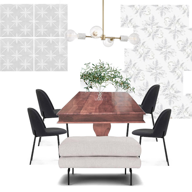
The wallpaper in the dining room is from Spoonflower, the largest indie design marketplace in the world, where you can create your own design or choose from over 650,000 designs online. I selected Parrots, Tulips & Ferns by Andrea Alice (I might be partial to the name). I love the subtle design and I love the hint of throw-back to the mid-century era.
The chairs and ottoman in the dining room are from Article a Canadian company full of mid century inspired furniture. I am in love with this store. I love the skinny legs of the chairs and how comfortable they are. They really add a juxtaposition to the antique duncan phyfe table.
Special thanks to my sponsors; Schaub and Company, Article, Hayneedle, Hudson Valley Lighting and Blanco Canada. I'd also like to thank Better Homes & Gardens for being the media partner for this event.
Be sure to check out the reveals of the other featured designers in the One Room Challenge (see links below). As always a special thank you to Linda of
Calling It Home for creating this event and
asking me to be one of the twenty featured designers of the One Room Challenge Fall 2018 edition. It is an honor to be included with this talented group. Check them out below:
If you're new here, let me give you some background, we bought this cute mid century bungalow as a small flip project and have made so many changes to it that we are beginning to fall in love. When we first opened the door it was a like a time capsule from the 1960's. You can get a better idea of what I'm talking about in the Week 1 before photos. Our aim is to sell this puppy back to a first time home buyer at a reasonable price so we've tried to keep our costs as low as a possible during this kitchen makeover. You will see our appliances are not top of the line but they fit our budget and still look good. We tried to DIY wherever possible like with the range hood, yes, that's a DIY range hood for under $250 (read more about it in Week 3). Oh yes and you can catch up on any of the previous weeks below:
Here is a quick pic of what the kitchen looked like a few weeks ago:
In the beginning we had planned to knock down the wall between the kitchen and dining room but for numerous reasons we weren't able to so we instead decided to expand the door way. This was a good solution because it does feel more open concept but there's enough wall to hide the dishes in the kitchen haha.
For our sink we selected the Blanco VISION 210 double SILGRANIT sink because of it's durability and looks. SILGRANIT is a natural granite composite material that is strong, durable and comes in seven colours. This sink is part of the VISION series that has a variety of bowl configurations, options and accessories plus it's made in Canada so that's a plus for me.
We also installed the Blanco SOLENTA Senso faucet. This faucet has touchless technology allowing you to activate the on and off switch without touching the handle. It's a really unique and practical feature (especially when you're cooking with poultry).
Our cabinet hardware is from Schaub and Company, they have a ton of selection of really unique yet timeless hardware. We selected Regatta pulls in a Satin Nickel finish. I love how delicate yet substantial they are and I love how they create a perfect horizontal line across each door. We hung them all horizontal (even on the uppers) to give it a modern and clean feel.
If you've been following me on Instagram
you know I was searching for some affordable copper pots because I really want the kitchen to have a mix of metals. I never found them so I couldn't make my pot rack as I had hoped but my
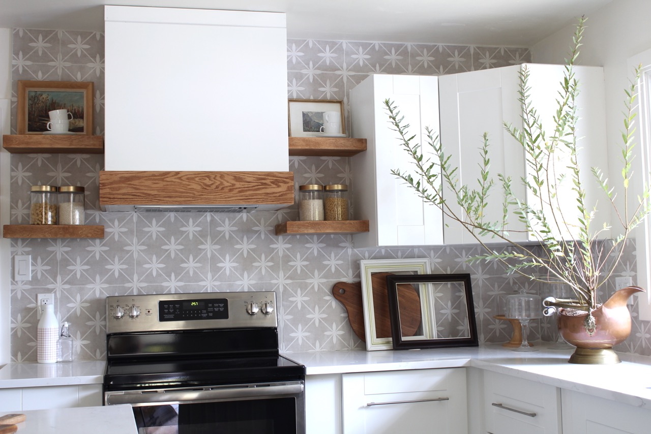
mother-in-law lent me an amazing antique copper urn and I think it adds the perfect amount of copper.
Our Laura Ashley ceramic tile backsplash in Wicker Dove Grey. We picked up this tile from Eden Tile-it and I love it. It adds a bit of interest without being over bearing. In an ideal world I would have done open shelves all the way across but I wanted to give the next home-owners some uppers with privacy (these are the only ones in the room).
These incredible counter stools are from Hayneedle. They are metal which is great for my two little kids because they can make a mess and I can wipe it right off. Plus they are super stylish and add another modern touch to the space while anchoring the island. They really balance the black framed window and dining chairs. The mirror is a thrift store find but I found another bamboo style mirror for you.
The wallpaper in the dining room is from Spoonflower, the largest indie design marketplace in the world, where you can create your own design or choose from over 650,000 designs online. I selected Parrots, Tulips & Ferns by Andrea Alice (I might be partial to the name). I love the subtle design and I love the hint of throw-back to the mid-century era.
The chairs and ottoman in the dining room are from Article a Canadian company full of mid century inspired furniture. I am in love with this store. I love the skinny legs of the chairs and how comfortable they are. They really add a juxtaposition to the antique duncan phyfe table.
Special thanks to my sponsors; Schaub and Company, Article, Hayneedle, Hudson Valley Lighting and Blanco Canada. I'd also like to thank Better Homes & Gardens for being the media partner for this event.
Media Partner Better Homes & Gardens | TM by ORC
07:00:00
14
comments
Hi all, it's week 5 of the One Room Challenge Fall 2018 edition. I'm feeling good and excited for the reveal next week. This week I took a breather while I prepared my son's costumes for Halloween, this usually isn't so time consuming however they kept changing their minds after I was half through creating their last idea.
A few things happened this week including staining the floating shelves and shopping for a vintage table. Oh yes and my wallpaper arrived! It's from Spoonflower, the largest indie design marketplace in the world, where you can create your own design or choose from over 650,000 designs online. I selected Parrots, Tulips & Ferns by Andrea Alice (I might be partial to the name). I love the subtle design and I love the hint of throw-back to the mid-century era. I usually know I'm on the right track with design when my husband has a confused look when I show him my plans. Here are my previous week's posts:
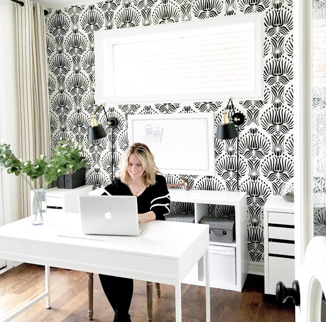
I'm just waiting on a few key furniture pieces to arrive and then it's camera time. Here is my last One Room Challenge reveal of my office makeover to tide you over until next week.
Also, be sure to check out the other featured designers in the One Room Challenge and as always a special thank you to Linda of Calling It Home for creating this event and asking me to be one of the twenty featured designers of the One Room Challenge Fall 2018 edition. It is an honor to be included with this talented group. Check them out below:
Media Partner Better Homes & Gardens | TM by ORC
05:00:00
No comments


